You can read Color Theory Part II here.
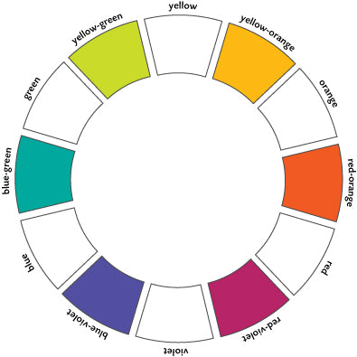
The color wheel
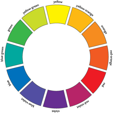
The color wheel is a way of showing the relationships between colors on the spectrum. There is more than one kind of color wheel, but this 12 spoke wheel, showing primary colors, secondary colors and tertiary colors is an accepted way of showing colors. On the wheel, colors are arranged by their relationship to each other. The colors closest to each other in quality will lie closest to each other on the wheel. The colors most different in quality will lie farthest apart. So, yellow is next to yellow-orange for example, and farthest from violet.
Primary colors
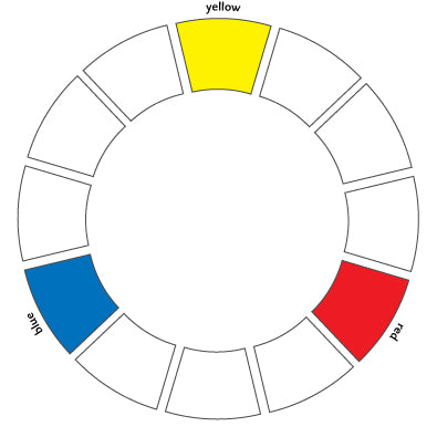 The primary colors are (theoretically) the purest colors. This idea of "purity" in color practice is usually theoretical; if you look closely enough at any color you will find traces of other colors. Especially in yarn. The primaries are yellow, red and blue.
Secondary colors
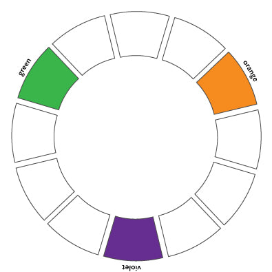 Secondary colors are the visual midpoints between the three primaries: they are orange, violet, and green.
Tertiary colors
 Tertiary colors are the visual midpoints between the three secondaries: they are yellow-orange, red-orange, red-violet, blue-violet, blue-green, and yellow-green.
Color terminology
Saturation

Refers to the intensity of a color. This image shows orange, saturated on the left, moving towards no saturation on the right.
Shade
 A color with black added. When shades or tints are low in color saturation, they move towards neutral.
Tint
A color with white added
Hue
The color, defined by its wavelength. eg, blue, red.
Value
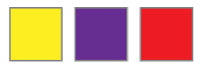
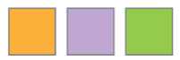
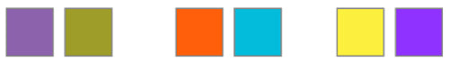
Refers to how light or dark something is. Different colors can share the same value. Tip: not sure if colors have the same value? Squint your eyes to blur what you are looking at; differences in value will be more obvious. Some colors are lighter than others. The most intense yellow, for example, is much lighter than a violet or red, as shown by the image on the left. The image on the right shows colors of different intensity (or saturation), but similar value.
Coolness
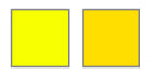 How close to blue a color is on the wheel. Note that coolness and warmth are relative. This picture shows two yellows; the one on the left, which is slightly green, is cooler than the one on the right. Cool colors appear to recede.
Warmth
How close to yellow a color is on the wheel. Warm colors appear to come forward.